 |
| Pie Thief, by Amber Alexander |

06 January 2011
Amber Alexander -- beautiful animal watercolours full of whimsy


05 January 2011
At the #87 lay up stop at Carlingwood Mall
No matter where I am there is always something to draw. At Sears: An old, mustachioed man in a tweed beret at the wheel of an idling Ford F150.
Have you seen me before?
 |
| January 3, 2011 |
 |
| January 5, 2011 |
This morning, drinking coffee as I do every morning while my daughter nurses, I looked out the window for a long while. (I bought that house for its huge garden and lovely large corner windows.) Funny thing, the snow and sky were the exact same colour, indistinguishable -- a really, really pale whitish blue. A few minutes later, I caught the moment when the snow became white, as the sun rose.
OPTIMISM
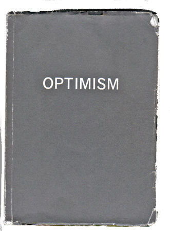 |
| Blank book, by Bruce Mao |
Cockiness and vectors
 I forgot to post this last year. Oops!
-------
That wedding invitation assignment from my violinist friend in San Francisco sure sold me on vector illustration! She asked for maple and oak leaves, and in typical fashion I started outside by collecting samples from my oak tree and the neighbour's maple.
I stared at the brown backyard leaves for a while until I got a sense of maple and oak basic leaf structure. It looks like the maple leaf's points fall in a pentagram shape and the oak leaf is an upside-down teardrop with holes cut out along the sides. Next, I cruised the Net and some ancient plant books from my bookshelf to explore oak and maple varieties. I chose the Sugar Maple and White Oak. They're classic shapes, very recognizable -- the sugar is pointy and curvy, each lobe swirling out from the main vein. Think Canadian flag, but bendier. White Oak is the oak leaf with the smooth, round lobes. It's really gentle and voluptuous.
Beyond looks, with a Canadian bride, the Sugar Maple was the natural choice given Canada's maple syrup fame. For him, since I couldn't find a native Californian oak, I chose the White Oak as it's the most loved among oaks.
So I did a few drawings in black ink (she'd told me she wanted a Japanese look, being Japanese herself) and scanned them into Photoshop.
And as soon as those leaves landed next to the wedding text, they looked like garbage! Eww.
I'm no graphic designer, right. When I took this project on, all I thought about was the illustrations. Wrong! I completely neglected to remember that the images needed to flow with the graphic design. These images looked very odd, very weak and not wedding-y at all next to the Japanese-style typeface I was using.
So I figured I could do some fully worked-up paintings -- either on paper or on 'Shop -- no doubt they'd look nice as opposed to those little ink sketches. But I couldn't take the risk -- taking that kind of time wouldn't leave me any margin for error if I had more screw-ups. I needed attractive, simple images that would be easy to layout and resize and colour on multiple projects: the invitations, menus, and whatever else. I didn't want to do some paintings and then have them print poorly or something.
Soooo I figured I'd try doing vector images because they've got that versatile thing going for them, apparently. But, yeah. My lord, that was tough to learn. In hindsight, I could've managed a couple of watercolours in the time I spent sifting through tutorials and making an ass out of myself with the Pen Tool on Photoshop. I've tried it before with no success, but it's amazing what necessity will do for me.
(The Pen Tool is totally unintuitive, at least at first. You click on the screen a starting point and end point for a curve, and pull little handles to affect its direction and (slope?). I finally had a break-through when Photoshopcafe released a new tutorial this week. That and some help files on "vector masks" got me through.)
The result is some spectacularly unimpressive leaves, but hey, it's my first time :)
She seems happy, and that's what matters.
06 April 2010
Red bonsai woodcuts

I'm a people artist at heart, but the last couple of years I've been concentrating on nature, as in this piece.
It took ages (2 years) between the head-on collision, house purchase, pregnancy and baby. Hoping I am back to a reasonable production rate. Also hoping more friends will ask for my help for their projects.
Wrote this sorry little poem the other day as I was feeling like a failure (my chief fault).
The spider on this orchid
kills a mealy bug
-- there is no meaning.
22 March 2010
Shows what MY priorities are
Ottawa is a funny little city, usually symbolized by its Parliament building or canal (the "longest skateway IN THE WORLD!"). Neither are the outstanding feature, or the most unique among capital cities. Instead, it's the farm.
Yes, there is a farm in the middle of town. With cows, horses, rabbits and... transgenic sheep. (You can make a skirt out their milk. Well, you probably can't. They use a special machine.)
See, we don't need more urban centres. People actually want more country. Ask them. They only move to cities for that city paycheque. So, all ye living in cities other than Ottawa, read what I did last Thursday and tell me you don't think the coolest thing about this place is the farm.
The Central Experimental Farm (that's its grown-up name) has fields and pastures, greenhouses and an observatory among other things. Last week I staked out the Fletcher Wildlife Gardens, several acres of woods and swampland managed so as to attract bees, butterflies, birds and other creatures. It's next to the Arboretum, and across from the Ornamental Gardens and New Hedge Collection.
To get there, I stuffed my daughter into the baby pack pack, and we took the bus downtown. I got off a stop too late, so we cut up through the trails to get back to the start. Most things being still beige or brown-coloured at this time of year, and with snow still on the ground, the wide-eyed baby and I had the place largely to ourselves, along with an astonishing supply of old tweedy gents and their dogs.
The long grasses swayed with a hushing sound as we tromped along. I passed a dozen wooden birdfeeders and one uninhabited butterfly garden. l admired a white stand of birch.
After circling a beaver pond, we toured the winter-dormant Backyard Garden. An Ontario naturalized garden, it will feature native plant varieties. I'm sure I can be persuaded to re-visit later in the spring to see them.
In a patch of sunny forest I sat down cross-legged to feed the baby. At home, her slow pace at the breast and table can be trying. But there, after twenty minutes or so, the squirrels began bounding closer and chickadees gathered to chirp on branches overhead. Lovely.
What I liked about the Gardens wasn't the species variety or any aspect of the arrangement of things. It's how familiar it was: pieces of Ontario - forests and grasslands at different maturity stages - cobbled together.
 |
| from the Fletcher Wildlife Garden website |
See, we don't need more urban centres. People actually want more country. Ask them. They only move to cities for that city paycheque. So, all ye living in cities other than Ottawa, read what I did last Thursday and tell me you don't think the coolest thing about this place is the farm.
The Central Experimental Farm (that's its grown-up name) has fields and pastures, greenhouses and an observatory among other things. Last week I staked out the Fletcher Wildlife Gardens, several acres of woods and swampland managed so as to attract bees, butterflies, birds and other creatures. It's next to the Arboretum, and across from the Ornamental Gardens and New Hedge Collection.
To get there, I stuffed my daughter into the baby pack pack, and we took the bus downtown. I got off a stop too late, so we cut up through the trails to get back to the start. Most things being still beige or brown-coloured at this time of year, and with snow still on the ground, the wide-eyed baby and I had the place largely to ourselves, along with an astonishing supply of old tweedy gents and their dogs.
The long grasses swayed with a hushing sound as we tromped along. I passed a dozen wooden birdfeeders and one uninhabited butterfly garden. l admired a white stand of birch.
After circling a beaver pond, we toured the winter-dormant Backyard Garden. An Ontario naturalized garden, it will feature native plant varieties. I'm sure I can be persuaded to re-visit later in the spring to see them.
In a patch of sunny forest I sat down cross-legged to feed the baby. At home, her slow pace at the breast and table can be trying. But there, after twenty minutes or so, the squirrels began bounding closer and chickadees gathered to chirp on branches overhead. Lovely.
What I liked about the Gardens wasn't the species variety or any aspect of the arrangement of things. It's how familiar it was: pieces of Ontario - forests and grasslands at different maturity stages - cobbled together.
Subscribe to:
Posts (Atom)